Andrea Anner is a Swiss graphic designer, developing comprehensive digital and printed matter.
She has established AnnerPerrin, a collaborative graphic design practice with Martina Perrin.
Together with Thibault Brevet, she has co-founded AATB, a practice for Non-industrial Robotics.
EXPERTISE
Corporate Identities
Art Direction
Web Design
Books, Catalogues, Magazines
Type Design
Exhibition Design
Information Design
CLIENTS
Companies
Ariake, furniture, Morodomi, Japan
Cheil worldwide, London
green marathon, Zurich
Dînette, Catering and Bistro, Berlin
gutundgut, consultancy for tourism, Zurich
Kunstbetrieb, production of artistic projects, Basel
Leu Numismatik, numismatic, Zurich
Oriental Sugaring, Zurich
Pramma, handbags, New York
SAC, Swiss Alpine Club
Samsung Electronics, Seoul/Suwon
Schweizer Museumspass, Swiss Museum Pass, Zurich
Selavy, Champagne, London
SMG immobilien, real estate, Zurich
Tourismus Camp Schweiz, tourism event, Zurich
Art, Architecture, Design, Music
Ronan & Erwan Bouroullec, designer, Paris
Céline Burnand, artist, Berlin
Lili Gayman, designer, Paris
Charlotte Herzig, artist, Berlin
Gamut, music collective, Zurich
Loris & Livia, designer, London
Maya & Daniele, photographers, Zurich
Valeria Napoleone, art collector, London
Whood x Mug, architecture studio, Lausanne
Institutions, Museums, Universities
Fondation Nestlé pour l’Art, art foundation, Lausanne
HSLU, Lucern University of Applied Science and Arts, Lucerne
Kunstraum Kreuzlingen, art space, Kreuzlingen
Loevenbruck, art gallery, Paris
Luma Arles, foundation, Arles
Salts, gallery, Birsfelden
ZHDK, Zurich Univeristy of the Arts, Zurich
EXPERIENCE
Since 2018: Co-Founder, Creative Director, AATB GmbH, Zurich
Since 2014: Collaboration with Martina Perrin as AnnerPerrin, Zurich/Marseille
2014–17: Freelance Graphic Designer for Greige, Berlin
2014–15: Freelance Graphic Designer for Simon Palmieri, Berlin
2012–13: Freelance Type Developer for Swiss Typefaces, Lausanne/Berlin
2010: Graphic Designer for Sara de Bondt studio, London
2009–10: Freelance Graphic Designer for Graphic Thought Facility ( GTF ), London
2009: Internship at Graphic Thought Facility ( GTF ), London
2008–9: Internship at Value and Service, London
EDUCATION
2010–12: Master in Art Direction: Type Design, ECAL, Lausanne
2005–08: Bachelor in Visual Communication, ZHDK, Zurich
2007–08: Exchange Semester, Danish Design School, KADK, Copenhagen
DOWNLOAD
A pdf portfolio
Andrea Anner
37, Rue Estelle
13001 Marseille
+33 652 94 90 48
hi@andreaanner.ch
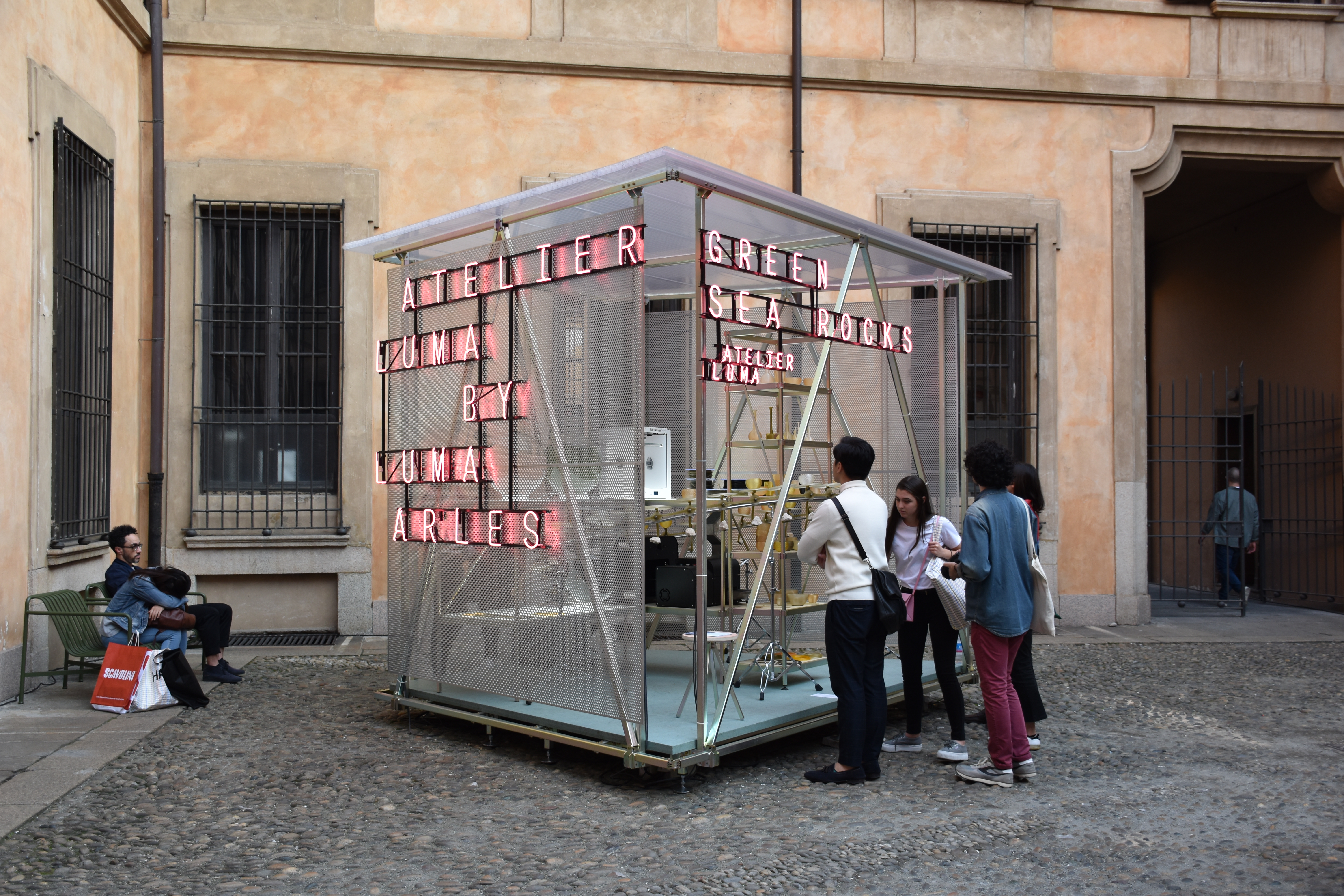
Atelier Luma at Milan Design Week. Info
On the occasion of Milan Design Week, Atelier Luma presented a selection of projects at Palazzo Clerici. Studiolos acted as an open platform, hosting each a different project that highlights a specific aspect of design, production, and materiality manifested in the installation. I developed the signage and promotion material of the installation.
Client: Atelier Luma
Format: Exhibition graphics, brochure
Year: 2018
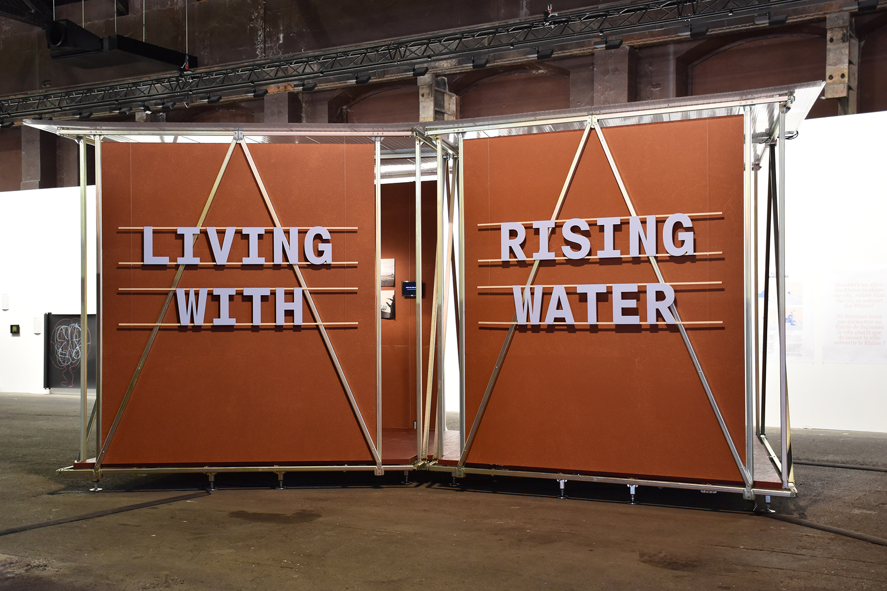
Atelier Luma – Living with Raising Water. Info
Atelier Luma organised a Masterclass on floodproof and demountable architecture. Students from various countries worked on design solutions to inhabit flood-prone areas and adaptability to flood risks. The Masterclass outcomes were presented in a publication and an exhibition during the Luma Days in Arles.
Client: Atelier Luma
Format: Exhibition graphics, publication
Year: 2018
Collaboration with: Elizabeth Guyon, Henriëtte Waal
Ariake Typeface and Identity. Info
Ariake is a furniture brand started by Legnatec and Hirata Chair, two factories from the furniture town of Morodomi in Saga prefecture, Japan.
Client: Ariake
Format: logo, display typeface, stationery, website, look book, exhibition graphics, videos, social media
Year: 2016-18
Collaboration with: Martina Perrin, Sebastian Stadler
Pramma UP Collection. Info
Prama is a NYC-based brand for luxurious handbags. We did the art direction and lookbook for the online appearance of the 2016 “UP Collection”. Forms of lights and colours show the bags in the best light.
Client: Pramma
Format: Art Direction, Website
Year: 2016–17
Collaboration with: Martina Perrin
Development: Arnas Ziedavicius
Photos: Sebastian Stadler
Design of identity: Veronica Ditting
Céline Burnand Website. Info
Celine Burnand is a Berlin based Swiss artist whose charcoal drawings intend to crystallise social, historical and spiritual questions. The portfolio website in juxtaposing an overview of her work with detail views. The handwritten navigation brings in a personal note.
Client: Celine Burnand
Format: Website
Year: 2016
Whooxmug Identity and Website. Info
Lausanne based Whood x Mug is joint forces of Whood, an architectural studio and Mug, a wood engineer. Their identity brings together elements of both their preceding identities, combining them with new components and patters.
Client: Whood x Mug
Format: website
Year: 2016
Collaboration with: Raby Florence Fofana
Development: Thibault Brevet
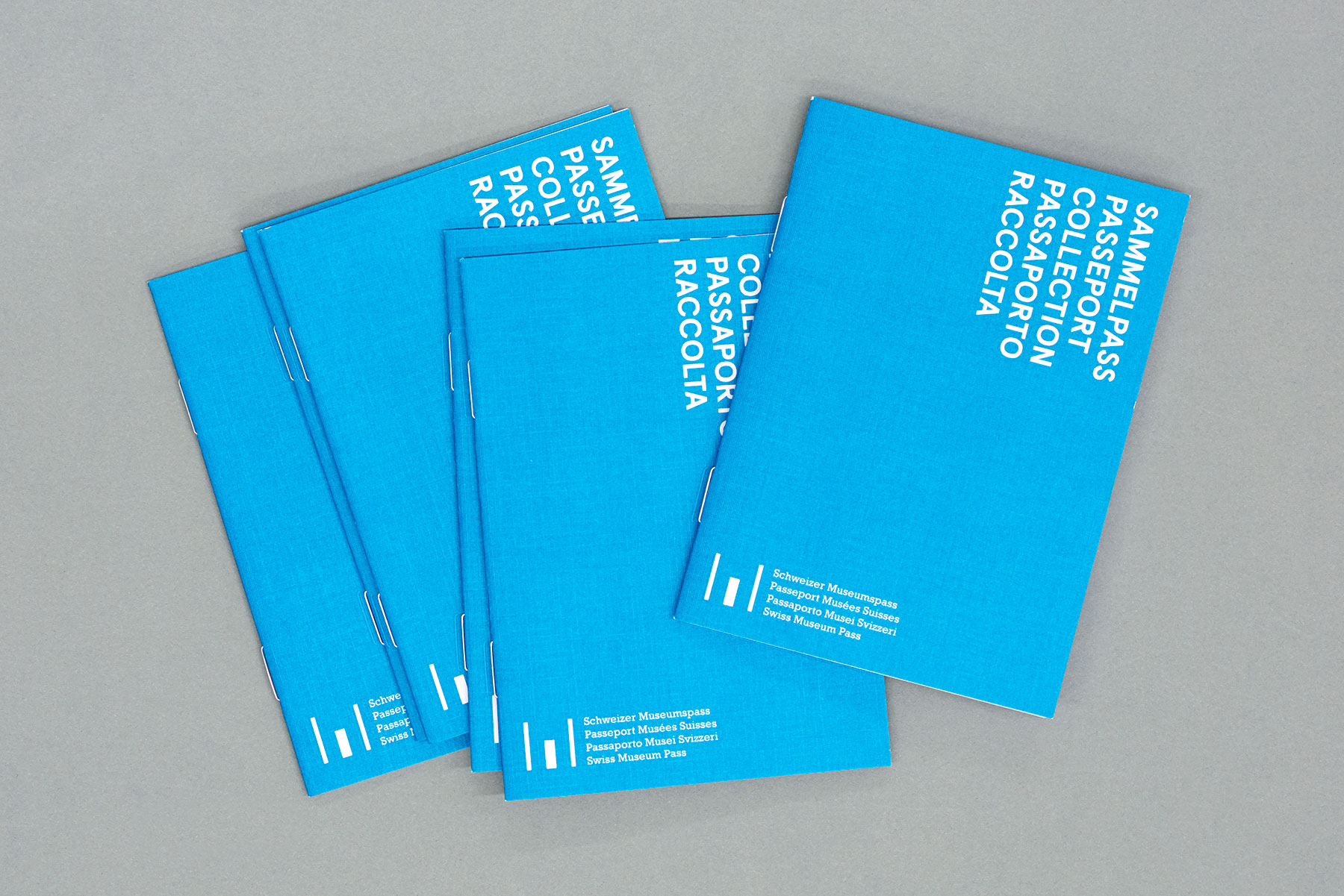
Museumspass Stempelaktion. Info
The Swiss Museum Pass gives access to over 500 museums. For their 20their anniversary, Museumspass initiated a “stamp action”, for which visitors could contribute stamp designs for museums. Every museum chose a design and produced a stamp. The stamps could be collected in a little booklet. We have developed the promotional material around this “action”, playing with the given elements of the identity of Museumspass.
Client: gutundgut
Format: brochure
Year: 2016
Collaboration with: Martina Perrin
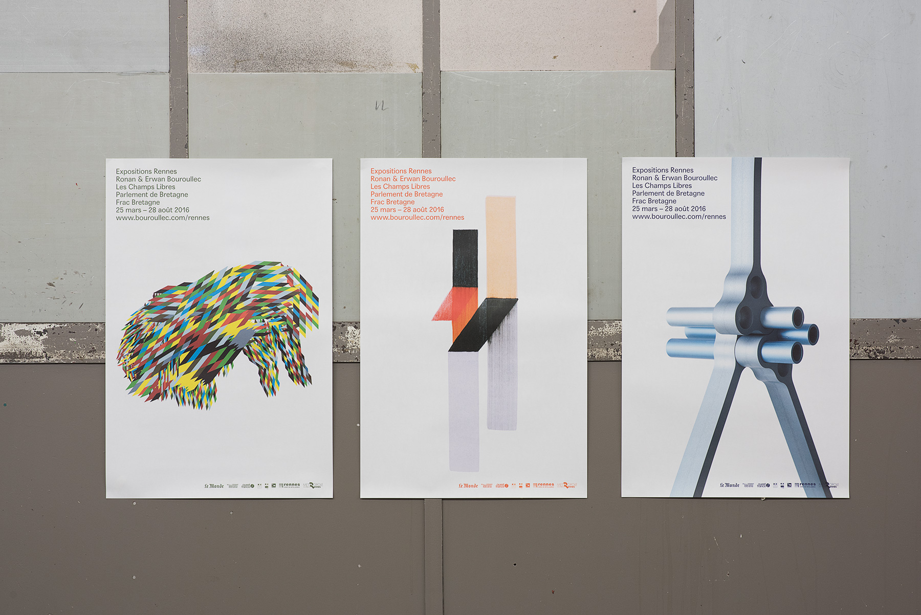
Bouroullec Rennes Exhibitions. Info
Ronan and Erwan Bouroullec realised four major exhibitions in Rennes. Our discrete graphics, working with a simple colour code put the work of Ronan and Erwan in focus. The website is conceived as a digital catalogue accompanying the exhibitions.
Client: Ronan & Erwan Bouroullec
Format: posters, signage, website, press release, handout, exhibition catalogue, social media/web banner, ads, invites, e-invites
Year: 2016
Collaboration with: Martina Perrin
Bouroullec Rennes Website. Info
Ronan and Erwan Bouroullec realised four major exhibitions in Rennes. Our discrete graphics, working with a simple colour code put the work of Ronan and Erwan in focus. The website is conceived as a digital catalogue accompanying the exhibitions.
Client: Ronan & Erwan Bouroullec
Format: website
Year: 2016
Collaboration with: Martina Perrin
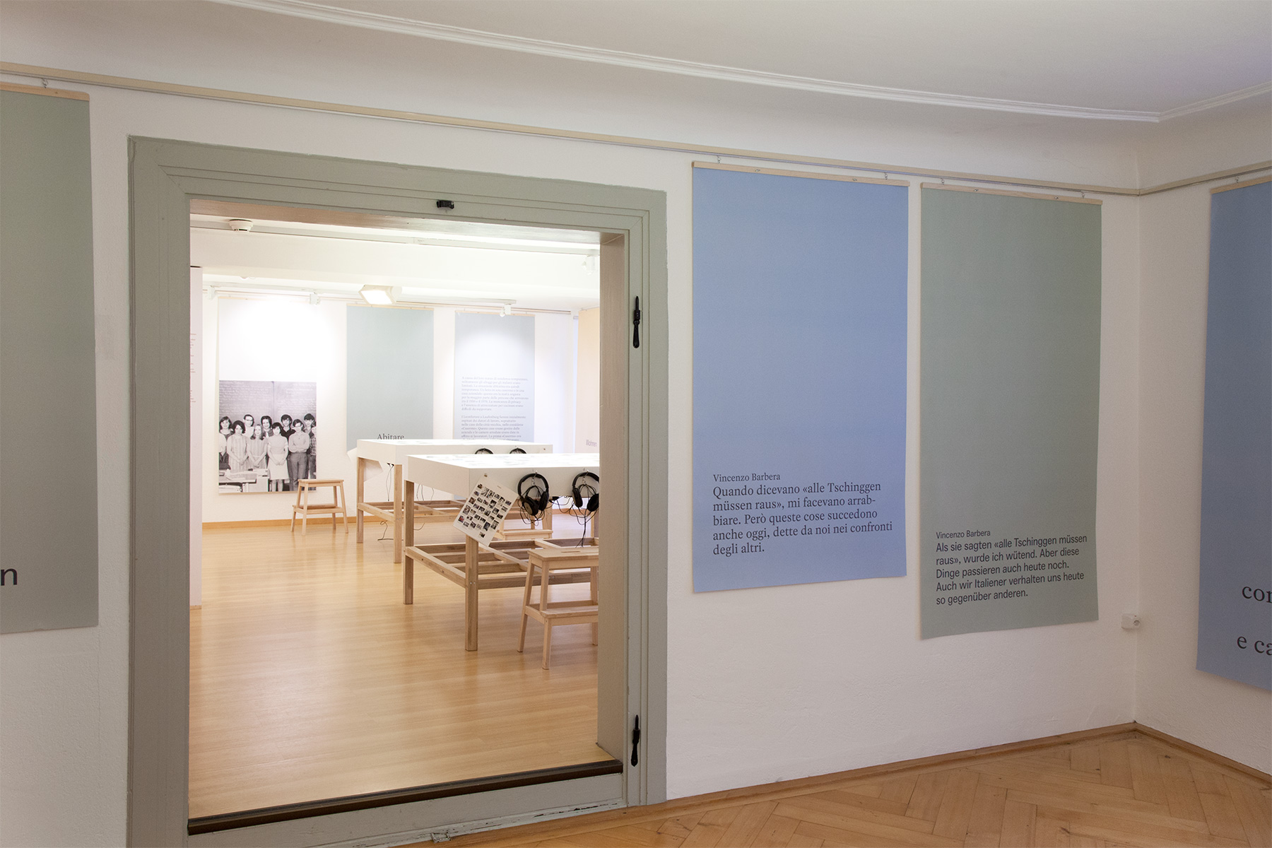
Leonforte Laufenburg. Info
Leonforte/Laufenburg Geteilte Erinnerungen is a research and exhibition project, that tells stories of migration between Sicily and Laufenburg. A longterm exhibition in the communal museum of Laufenburg brings together memories from migrants. The exhibition is accompanied by a catalogue, featuring archival photos, experts from interviews and multiple essays on the more than ever relevant subject of migration
Client: Vera Ryser
Format: Exhibition Design
Year: 2016
Collaboration with: Martina Perrin, Vera Ryser, Florence Willy
Photos: N. Bissig
Valeria Napoleone. Info
Valeria Napoloeone is an art collector from London. Her initiative ‘Valeria Napoleone XX’ is woking towards increasing the recognition of female artists through collaborations with institutions in the world of contemporary art. We developed two colourful and playful identities, both for herself and her ‘Valeria Napolone XX’ project, that reflect her stimulating and multifold art collection and personality.
Client: Valeria Napoleone
Format: identity
Year: 2016
Collaboration with: Martina Perrin
Gamut Website. Info
Gamut Kollektiv is a young jazz music collective, organising a series of concerts and a jazz festival in Zurich. A series of bold black and white illustrations builds the core element of their identity.
Client: Gamut Kollektiv
Format: Website
Year: 2016
Collaboration with: Martina Perrin
Development: Steffen Kraska
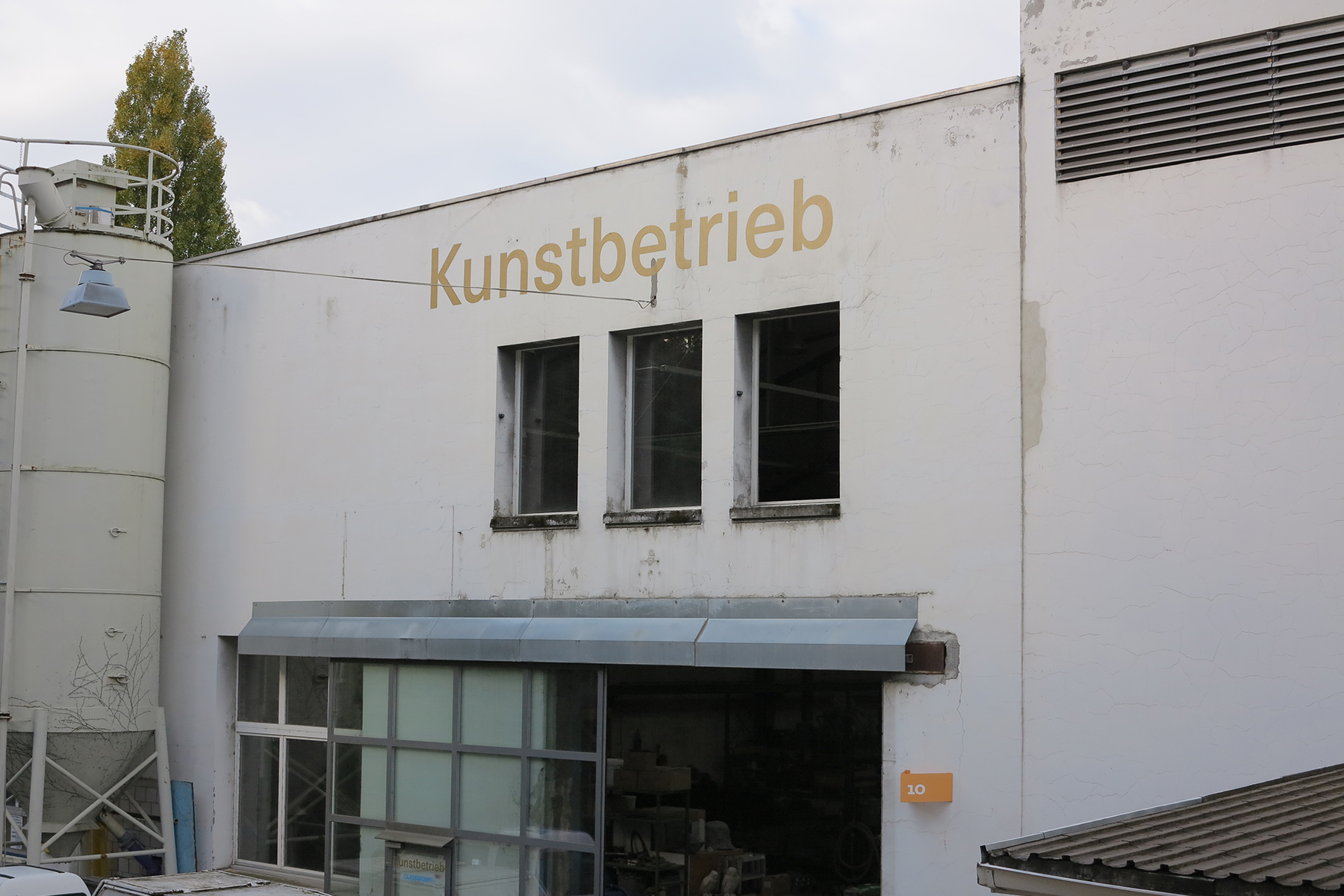
Kunstbetrieb identity Info
Kunstbetrieb realise contemporary art work, from advise through planning and production. For their 10th anniversary they did a rebranding for which we developed a plain typographic identity.
Client: Kunstbetrieb
Format: identity
Year: 2016
Collaboration with:
Development:
Photos:
Kunstbetrieb Website. Info
Kunstbetrieb realise contemporary art work, from advise through planning and production. For their 10th anniversary they did a rebranding for which we developed a plain typographic identity.
Client: Kunstbetrieb
Format: website
Year: 2016
Collaboration with:
Development:
Photos:
Website for Dînette. Info
Dînette is a catering service and bistro in Berlin serving modern French cuisine. The identity brings together a custom drawn typeface on pointillistic food illustrations.
Client: Dînette Catering & Bistro
Format: logotype, website
Year: 2016
Website for SMG. Info
SMG immoblien is a constructor, building with a strong focus on sustainability and ecology. The simple website presents their residential estates. A brochure introduces and compares the different house types in the estate.
Client: SMG
Format: logotype, stationery, website
Year: 2016
Collaboration with: Martina Perrin
Pramma Absolutely Collection. Info
Prama is a NYC-based brand for luxurious handbags. We did the art direction and lookbook for the online appearance of the 2015 “Absolutely Collection”. Forms of lights and colours show the bags in the best light.
Client: Pramma
Format: Art Direction, Website
Year: 2015–16
Collaboration with: Martina Perrin
Development: Arnas Ziedavicius
Photos: Jenny van Sommers
Design of identity: Veronica Ditting
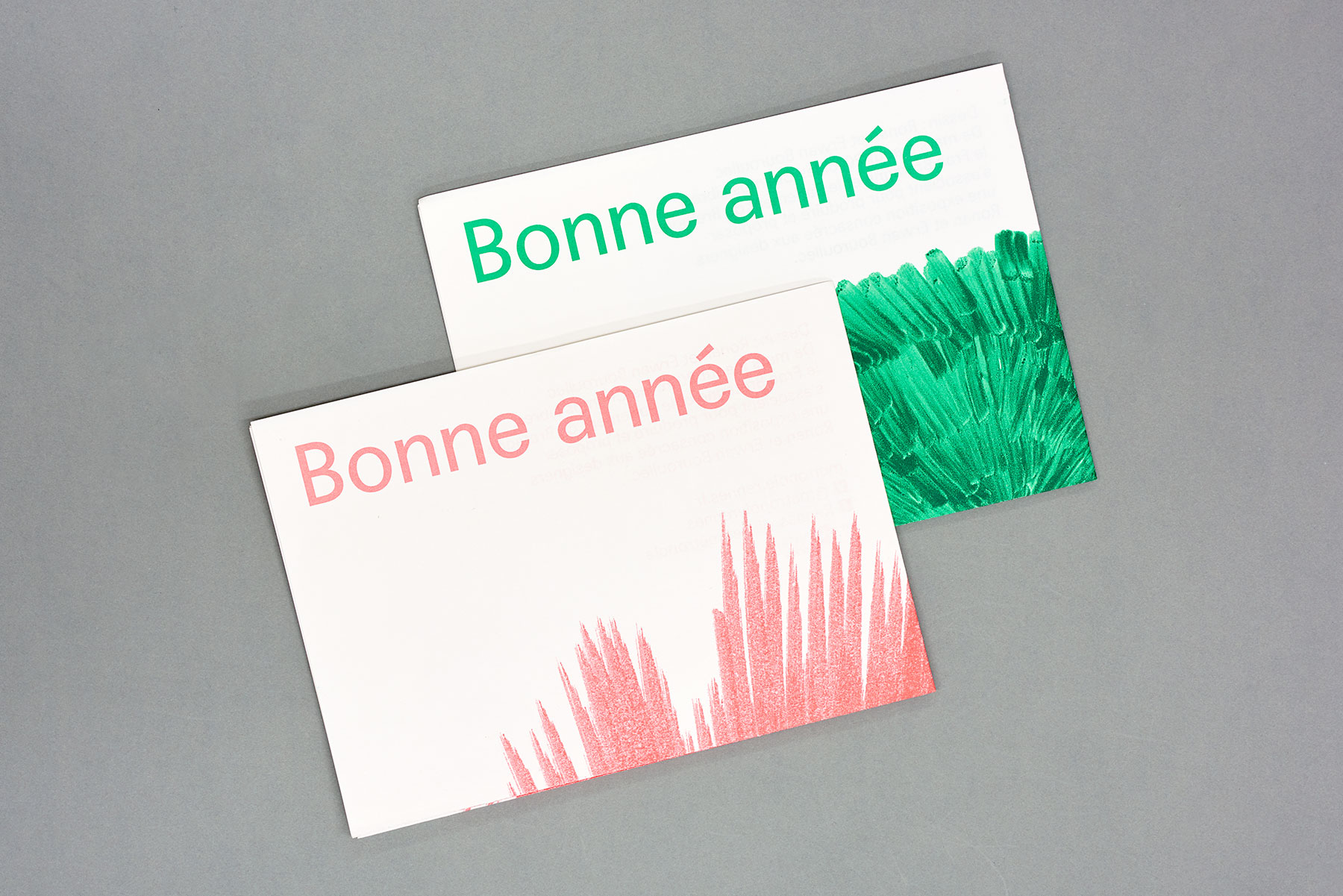
Bonne année, Posters. Info
The mayor and members of the government of Rennes wished their citizen a happy new year. In light of their upcoming exhibitions in Rennes, Ronan and Erwan contributed the illustrations and we did the graphics around.
Client: Ronan & Erwan Bouroullec
Format: pposters, billboards, cards, e-cards
Year: 2015
Collaboration with:
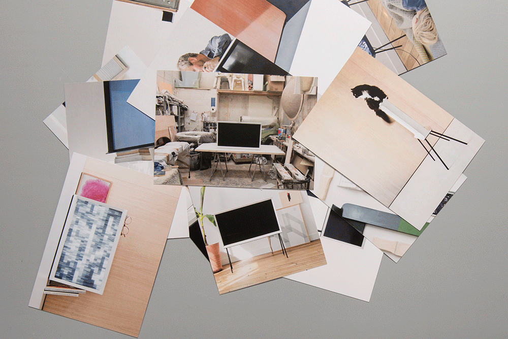
Exhibition graphic and printed matter for Samsung SERIF TV. Info
SERIF TV was presented at Somerset House during London Design Festival. We were in charge of the exhibition graphics.
Client: Samsung
Format: Exhibition Graphics
Year: 2015
Collaboration with: Martina Perrin
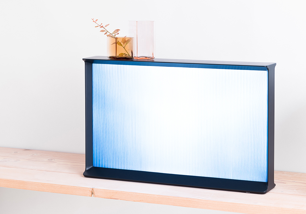
User Interface for Samsung SERIF TV. Info
In close collaboration with Ronan & Erwan Bouroullec and Gaël Hugo we developped the graphic part of the user interface for SERIF TV, that we nicknamed the “curtain mode”: Like pulling a curtain over the screen, the user interface applies a filter over the content giving an abstract impression of what is going on behind. When the “curtain mode” is active, viewers can access simple services such as a clock, Bluetooth speakers, apps and their photo gallery.
Client: Ronan & Erwan Bouroullec
Format: User Interface
Year: 2015
Collaboration with: Martina Perrin, Ronan & Erwan Bouroullec, Gaël Hugo
Development: Gaël Hugo(onemorestudio)
Photos: Ronan & Erwan Bouroullec
Catalogue for Masters of Fine Arts 2015, HSLU. Info
The catalogue for the graduation of Master Students in Fine Arts, Art Teaching and Art in Public Spaces at HSLU is a set of folded cards. Per student there is one card, with an image on one side, keyword on the other and a text on the project on the inside. The postcards come in a box, containting a map of where the artworkes could be seen on the graduation show.
Client: HSLU
Format: set of postcards, box
Year: 2015
Collaboration with: Martina Perrin
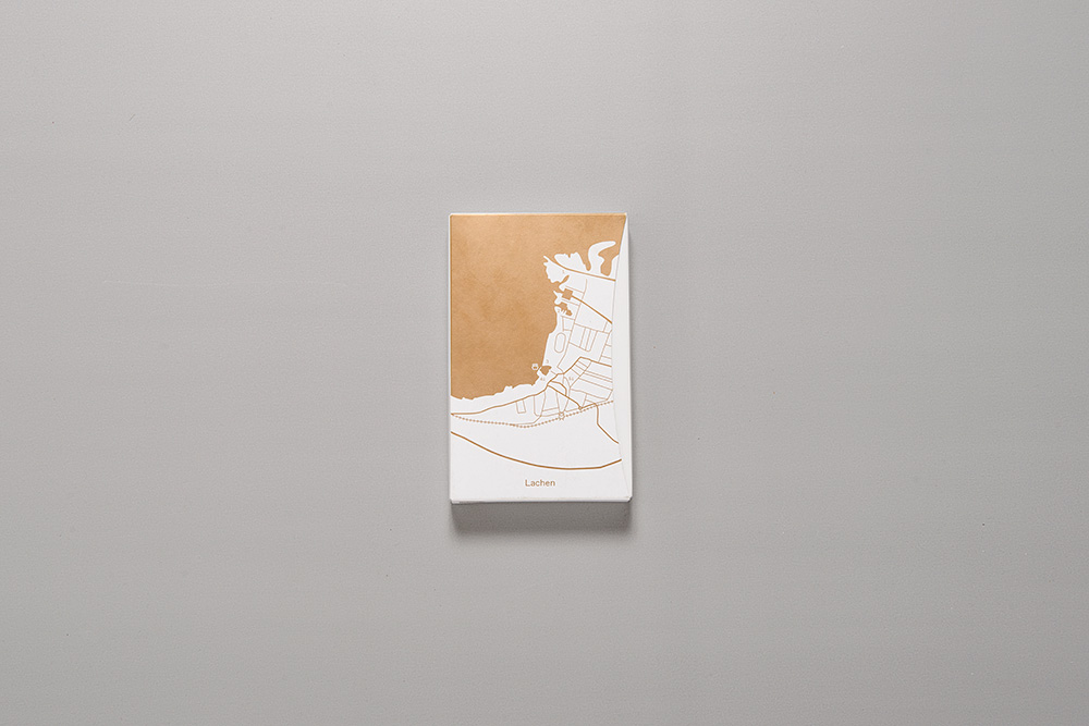
Website for gutundgut. Info
gutundgut develop and implement projects for tourism, leisure and culture. We developed their identity, drew their logotype and designed their portfolio website.
Client: gutundgut
Format: logotype, stationery, website
Year: 2015
Collaboration with: Martina Perrin
Development: Axial
Identity for Salts. Info
SALTS is a non-for-profit space that aims at developing outstanding proposals that respond to the specificity of its location. The new identity has been developed taking into account the old logo, reusing subtly the legacy 3D effect.
Client: SALTS, Birsfelden
Format: Identity, logotype
Year: 2014
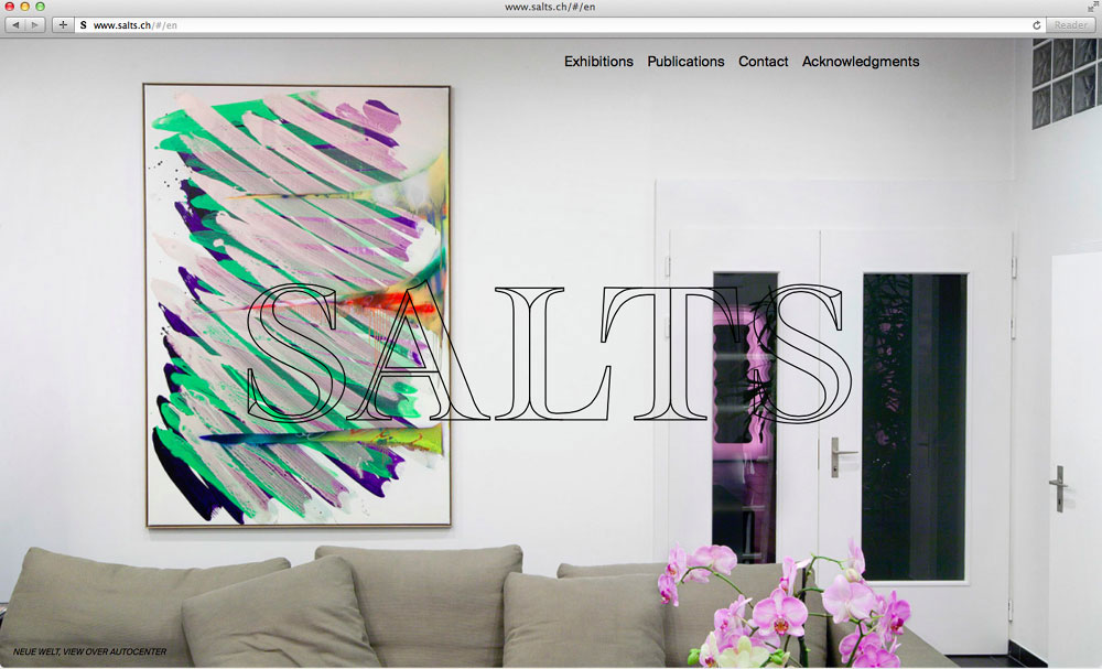
Website for Salts. Info
The website of SALTS has been designed to put the outstanding photographic documentation of each exhibitions forward. A split-effect makes portrait and landscape imagery blend together, creating surprising juxtapositions between exhibitions.
Client: SALTS, Birsfelden
Format: Website
Year: 2014
Collaboration with: Thibault Brevet
Development: AATB
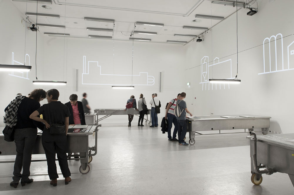
Wo ist Toni? Exhibition and five books. Info
An exhibition at the inauguration of Toni-Areal, the new builing of ZHDK, and at Z-Club, Venice during the 14th Architecture Biennale. “Wo ist Toni?” tells the story of Europe’s former largest dairy factory and its new purpose as the campus of Zurich Univeristy of the Arts. Five research volumes reveal architectural and industrial traces of the former diary factory in Switzerland, Poland, Turky, the Netherlands and Pakistan.
Client: Zurich University of the Arts, ZHDK
Format: Exhibition, books (5 volumes, english and german edition), animated projections, poster, invite, leaflet
Year: 2014
Collaboration with: Martina Perrin, Vera Ryser and Nina Bühlmann
Photos: Martin Moll
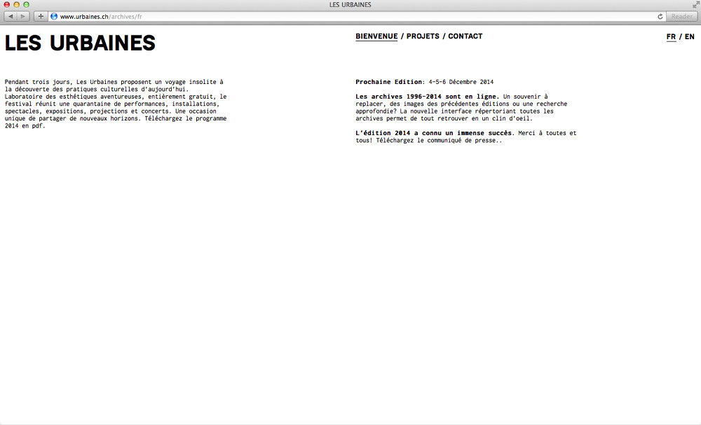
Archive website for Les Urbaines. Info
Les Urbaines is a festival for music, visual and performing arts in Lausanne. To contrast the strong identity developed each year, the Archives website has been developed as a more neutral and quiet object, that will accompany the changing identities along the years to come. An intuitive list browser lets visitors explore the full archive by using simple dynamic filters that can be combined to access details documents rapidly.
Client: Urbaines
Format: Website
Year: 2014
Collaboration with: Thibault Brevet
Development: AATB
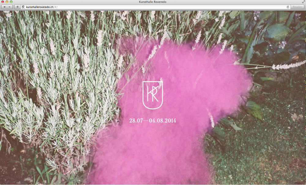
Website for Kunsthalle Roveredo. Info
Kunsthalle Roveredo is an artist residency in the Swiss mountains. The website presents the residentes as well as the program.
Client: Kunsthalle Roveredo
Format: Website
Year: 2014
Collaboration with: Thibault Brevet
Development: AATB
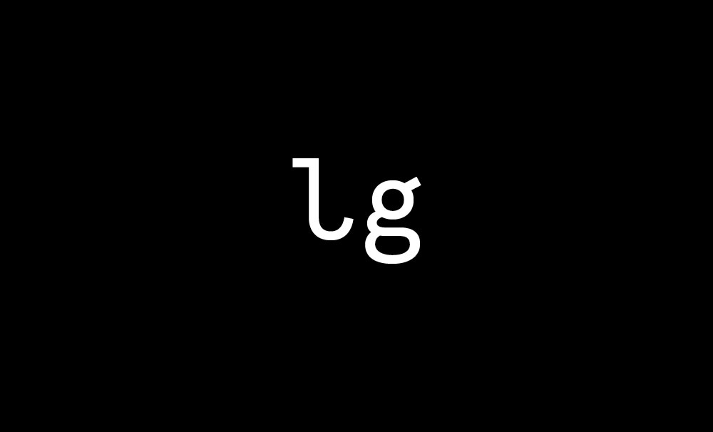
Website for Lili Gayman. Info
Identity for Lili Gayman Design Studio
Client: Lili Gayman, Paris
Format: Identity, logotype, business cards, website
Year: 2014
Collaboration with: Thibault Brevet
Development: AATB
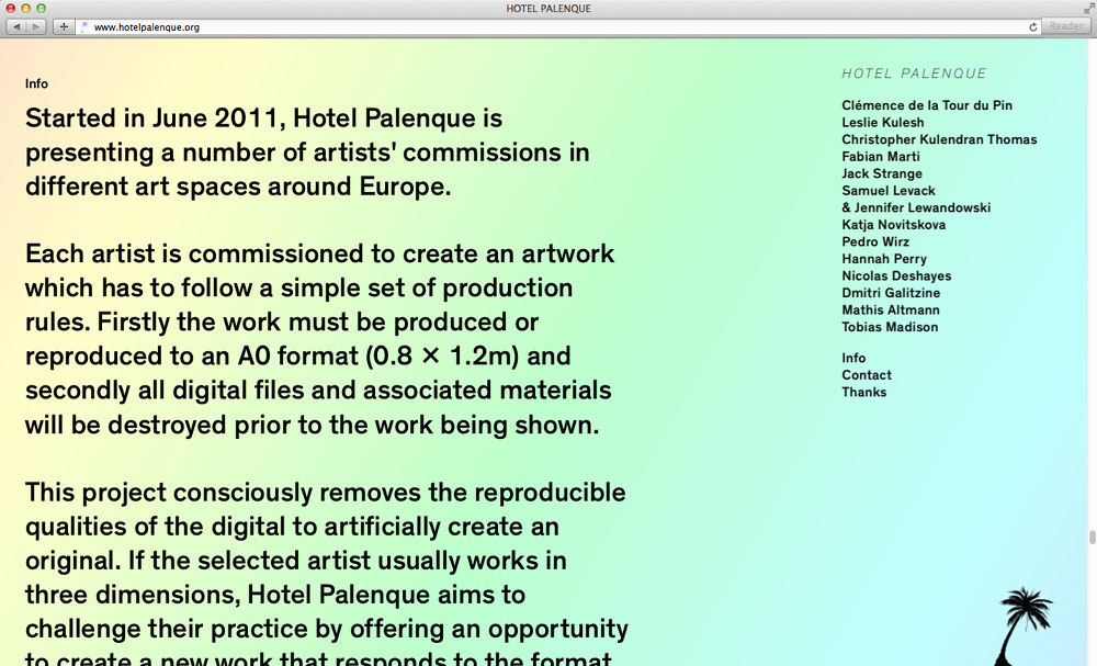
Website for Hotel Palenque. Info
Hotel Palenque is presenting a number of artists’ commissions in different art spaces around Europe. The website shows upcoming events and is an archive of past exhibitions.
Client: Elise Lammer, Berlin
Format: Website
Year: 2014
Collaboration with: Thibault Brevet
Development: AATB
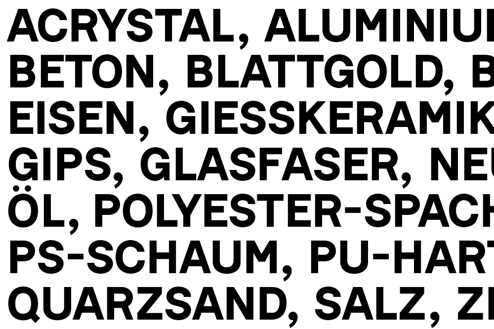
Brochure for Kunstbetrieb. Info
Kunstbetrieb is one of the most important casting houses in Switzerland. In order to get to know their employees, working processes and materials, we initiated a one week workshop and realised a material archive catalogue.
Client: Kunstbetrieb, Basel
Format: Brochure
Year: 2012
Collaboration with: Sarah Klein
Photos: Julien Gremaud
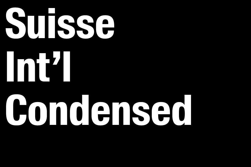
Suisse Int’l Condensed. Info
Under the guidance of Ian Party and in accordance with Suisse Int’l, I was drawing Suisse Int’l Condensed, a family with six weights and their italics.
Client: Swiss Typefaces, Lausanne
Format: Typeface in six weights with their italics
Year: 2013
Collaboration with: Ian Party
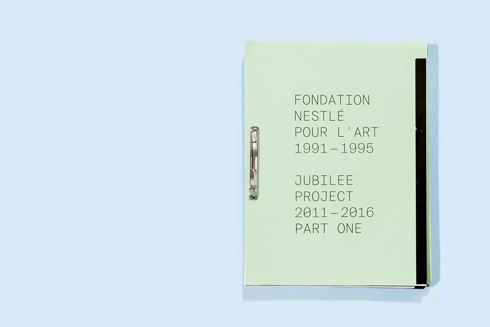
Fondation Nestlé pour l’Art, 1991—1996. Info
In 2016 the Fondation Nestlé pour l’Art will celebrate its 25th year. Students of the Master of Art Direction were invited to participate in the first part of the Nestlé Jubilee Project, for which the brief was to—through photography—re-imagine past projects supported by the foundation. My proposal for the design of the book was chosen and realized.
Client: Nestlé Art Foundation, Lausanne
Format: Book
Year: 2013
Collaboration with: Florine Bonaventure and Winfried Heiniger
Photos: Julien Gremaud
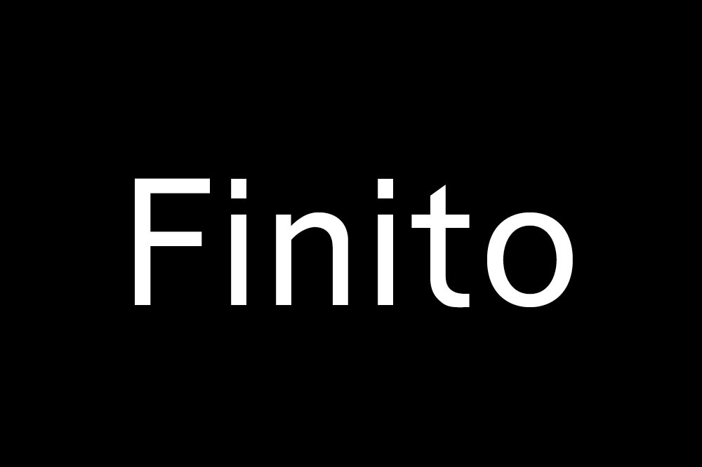
Finito. Info
The typeface Finito is a humanistic sans-serif for text,optimized for small sizes. It comes in six weights and (so far) one italic. Finito is based upon the same structure than the Rouillé, they share some peculiarities.
Client: self-initiated
Format: Typeface in six weights and one italic
Year: 2012
Master Thesis in Master of Art Direction: Type Design, ECAL. Supervised by François Rappo, Ian Party, Gilles Gavillet, Kai Bernau, Frederik Berlaen and Paul Barnes
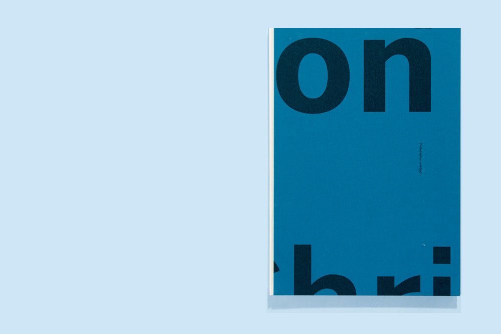
Finito Specimen. Info
Three half-bound books serve as specimen for Finito. Same text is shown in lower- and uppercase on opposite pages.
Client: self-initiated
Format: Type specimen: three half-bound books
Year: 2014
Master Thesis in Master of Art Direction: Type Design, ECAL. Supervised by François Rappo, Ian Party, Gilles Gavillet, Kai Bernau, Frederik Berlaen and Paul Barnes. Photos: Julien Gremaud
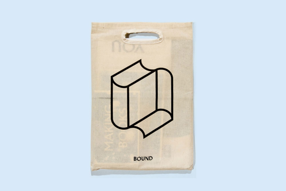
Bound. Info
Project during the Master of Art Direction: Type Design, ECAL. Supervised by Lukas Wassmann, Ludovic Balland, Gilles Gavillet, Angelo Crimele and François Rappo. BOUND are various small publications on the theme of the book: a book on making books, a lexicon on book related terms, a book on the digitising of books, a set of postcards, a poster, a series of portraits.
Client: self-initiated
Format: Various small publications, bag, poster
Year: 2011
Collaboration with: Philippe Karrer and Basile Mookherjee
Photos: Julien Gremaud
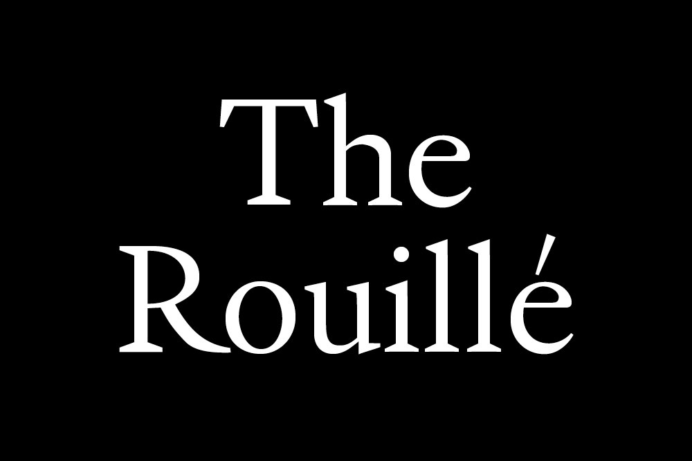
The Rouillé. Info
The Rouillé is a revival of a French Renaissance typeface from 1581, possibly designed by Robert Granjon. It is a contemporary re-interpretation of a typeface originally cut in steel.
Client: self-initiated
Format: Typeface
Year: 2010–11
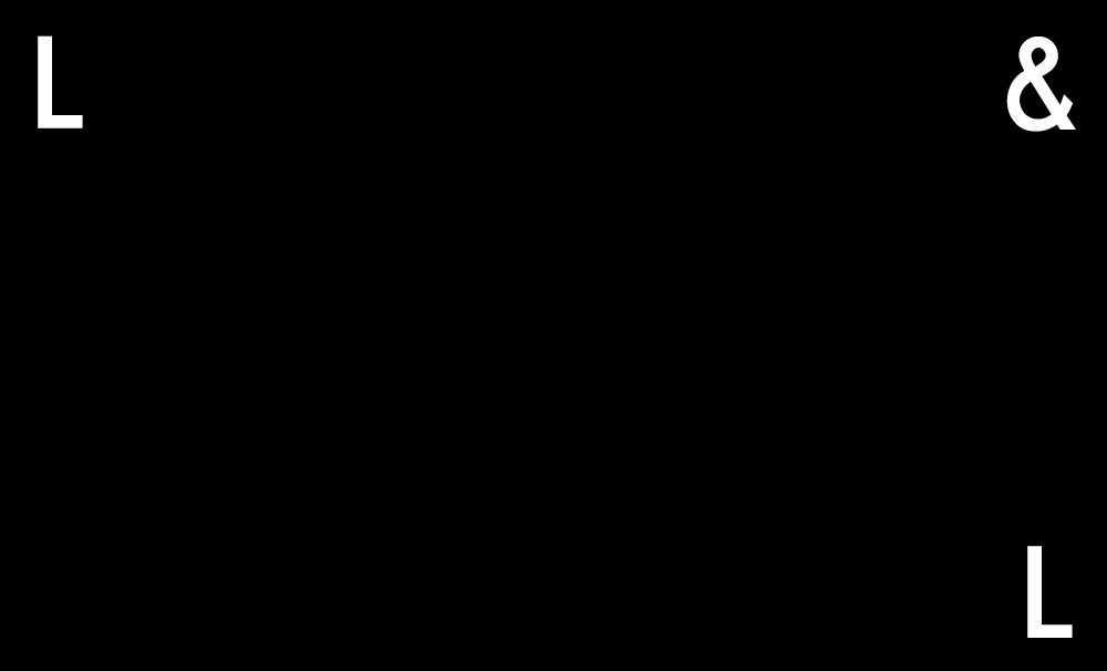
Loris&Livia. Info
Identity for London based product designers Loris&Livia. Two Ls and an ampersand build the core of their identity.
Client: Loris&Livia, London
Format: Logo, typeface, business cards, stationery, website
Year: 2014
Development: Philippe Egger
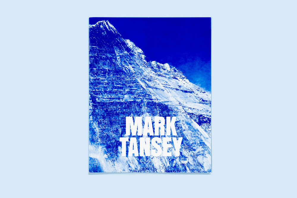
Mark Tansey. Info
The design of the folded poster plays with the characteristic of the painting; its symmetry and the fact that there is no right way to hang it.
Client: Client: Gagosian Gallery, London
Format: Invite
Year: 2009, at Graphic Thought Facility
Photos: Julien Gremaud
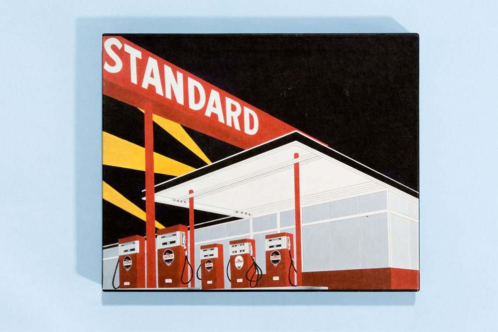
Ed Ruscha–Fifty Years of Painting. Info
A catalogue to accompany the major retrospective focusing exclusively on the paintings of Ed Ruscha. Alongside the text section, contextual images reference influences, sketches, photographs and works not shown in the exhibition.
Client: Hayward Gallery
Format: Exhibition catalogue in slipcase
Year: 2009, at Graphic Thought Facility
Collaboration with: In collaboration with Robbie Mahoney
Development:
Photos: Julien Gremaud
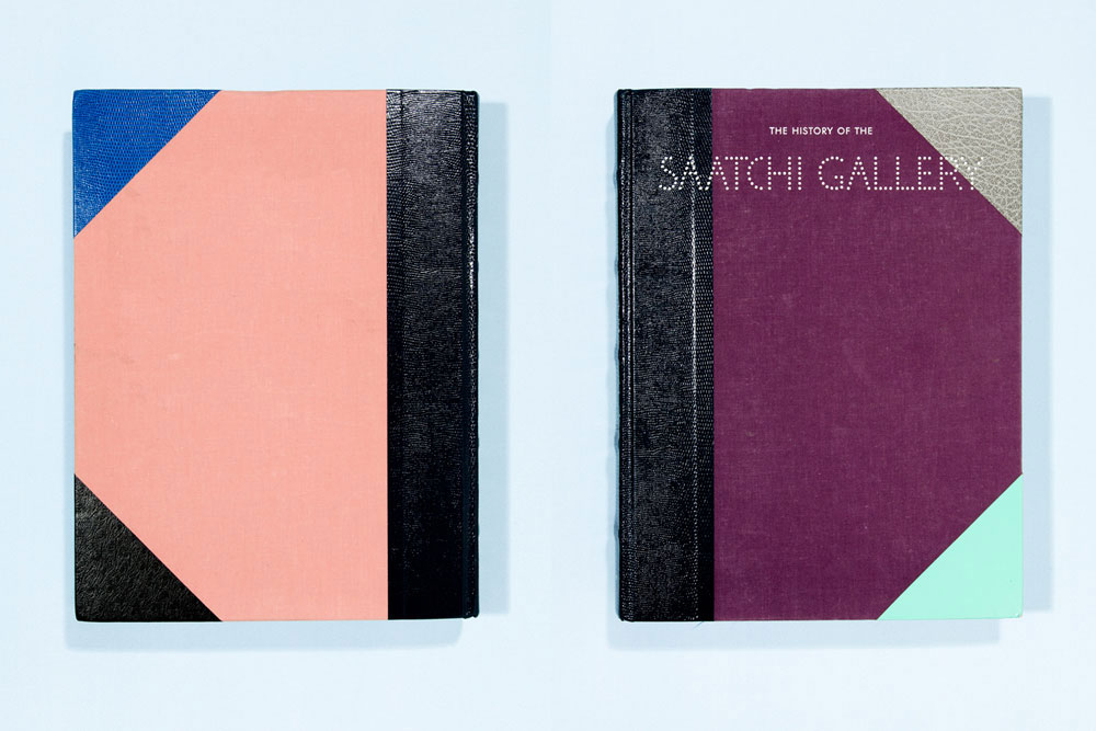
The History of the Saatchi Gallery, Book Cover. Info
The History of Saatchi Gallery showcases the diverse work of over 150 artists from the gallery’s most famous exhibitions. The cover material refers to traditional half bound books while the flashy mix of colours and materials create a contemporary and quirky look.
Client: Saatchi Gallery, London
Format: Book cover
Year: 2009 at Value and Service
Collaboration with: In collaboration with Sean Murphy and Corina Neuenschwander
Photos: Julien Gremaud
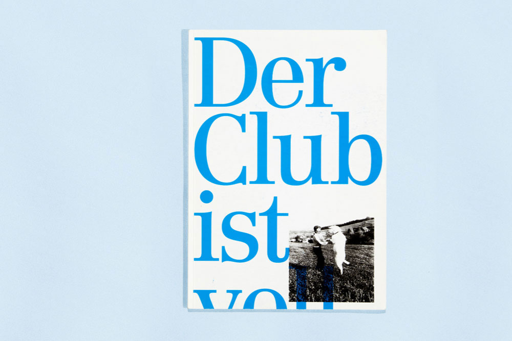
The Club is Full. Info
Our bachelor thesis is an investigation of Zurichs electronic music and club cultures. It features 12 interviews with renowned techno/house DJs from Zurich. The design translates mixing techiques into graphic design. The whole collection provides a deep insight into the state-of-the art of electronic music culture in Zurich.
Client: Bachelor thesis in visual communication, ZHDK
Format: 1 book, 12 magazines, 1 index
Year: 2008
Collaboration with: Barbara Hoffmann
Photos: Julien Gremaud
Supervised by Kurt Eckert and Matthias Michel